Mockups
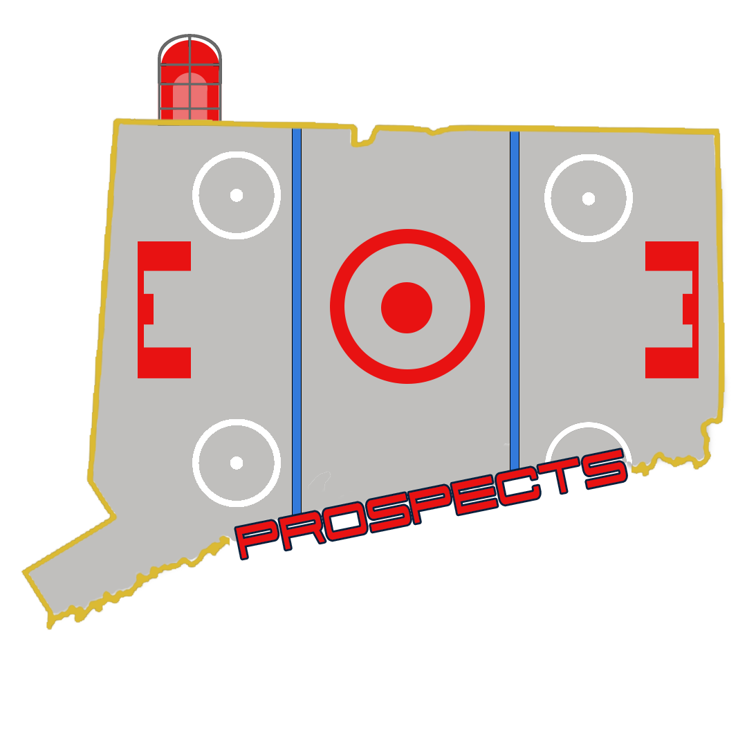
My first design I focused on creating a balance between the inner theme of the design and the overall picture. I wanted to emphasize the hockey rink within the design without overpowering the overall look. To do this I lowered the opacity of the rink so the outline would pop out more.
Version 1
In my second design I decided to do the opposite of the last and emphasized the hockey rink more within the logo. I brightened up all the colors to try and make them pop a little more.
Version 2
In my 3rd design, I wanted to try and represent the hockey rink more within the logo. Doing so I added the faceoff circles around the entire rink. After creating it, while I like the overall look, the logo gets too busy with all the content in the middle
Version 3
For the final mockup I created I wanted to focus more on the “Prospect” part of the design. Keeping with the diagonal line of the coast of Connecticut, I decided to italicize the font to create and continue the flow of the Connecticut border.


